Tips for an effective orthodontic office design
Every healthcare space is designed to uniquely suit the services it provides. And while the design of an orthodontic practice does very closely align with that of a dental practice, there are some fundamental differences and similarities that are important to consider.
At the very core, both orthodontic and dental practices should directly reflect the needs of the patients and practitioners using the space. One should step back and first consider what the practice's goals are. Knowing the goals will help consolidate the practical requirements, which will extend to the overall look and feel. Traffic flow, ergonomics, technology, aesthetics, and patient comfort are all key considerations when designing either space.
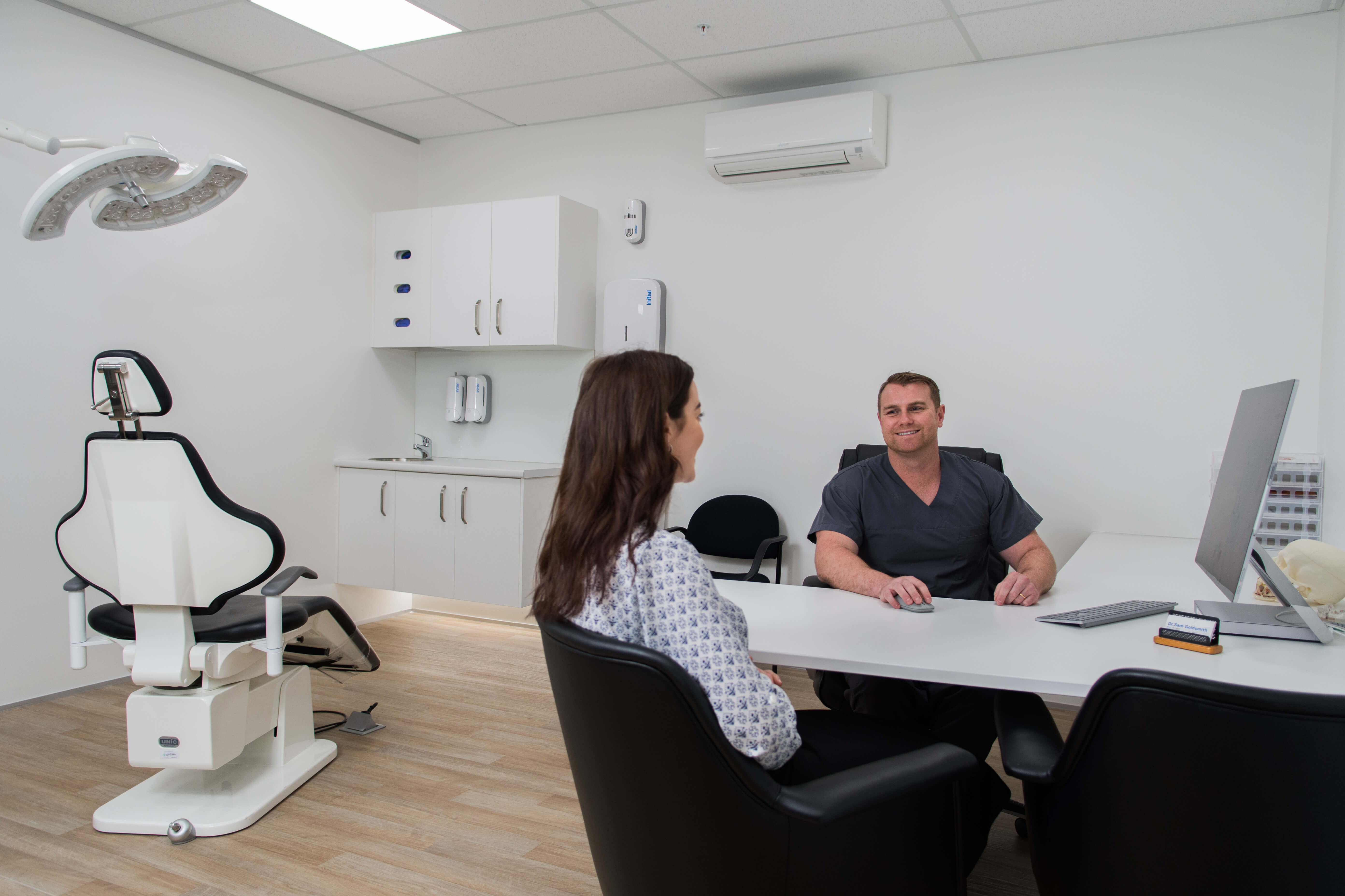
Your practice is an extension of your brand, and as a patient will likely come into contact with your office before you and your services, it’s important not to underestimate the impact practice design can have.
Key considerations of an orthodontic fitout vs dental fitout
In many regards, an orthodontic practice will require a very similar fitout to a dental practice. A key difference however, is traffic.
An orthodontic practice will typically see more people, and for shorter appointment times compared to a dental practice. Typically, orthodontic patients are younger and therefore frequently accompanied by an adult and additional family members such as younger siblings. This creates high volumes of traffic, stressing the importance of economising on layout, flow, and space in orthodontic office design.
Looking to set up your own dental practice?
Our free guide includes some fundamental marketing, sales, and service principles so you can focus on the things that will make a big difference to your new practice.
Floor plan
The floor plan is an appropriate place to start when designing an orthodontic practice as it is quite literally the foundation of your practice’s effectiveness. Does your floor plan align with your practice goals? Does it anticipate future growth? And does it support a dynamic flow that aids the activities of all who use the space?
An effective floor plan should achieve 3 main purposes:
- Establish traffic flow that reduces congestion and maximises space.
- Facilitate good ergonomics, efficiency, and productivity for staff members on a daily basis.
- Guide patients from A to B with ease in a way that’s low stress, and makes sense.
With high volumes of traffic and quick turnaround times for patients requiring minor adjustments and frequent check-ups, an orthodontic practice should adopt a fairly fluid and flexible floor plan. If not well-coordinated, congestion can easily occur disrupting productivity and causing frustrations for all.
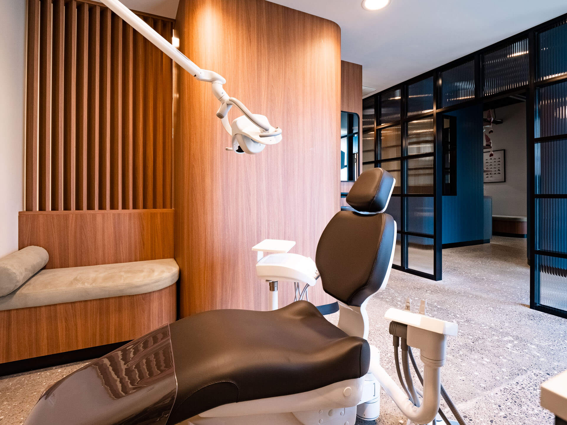
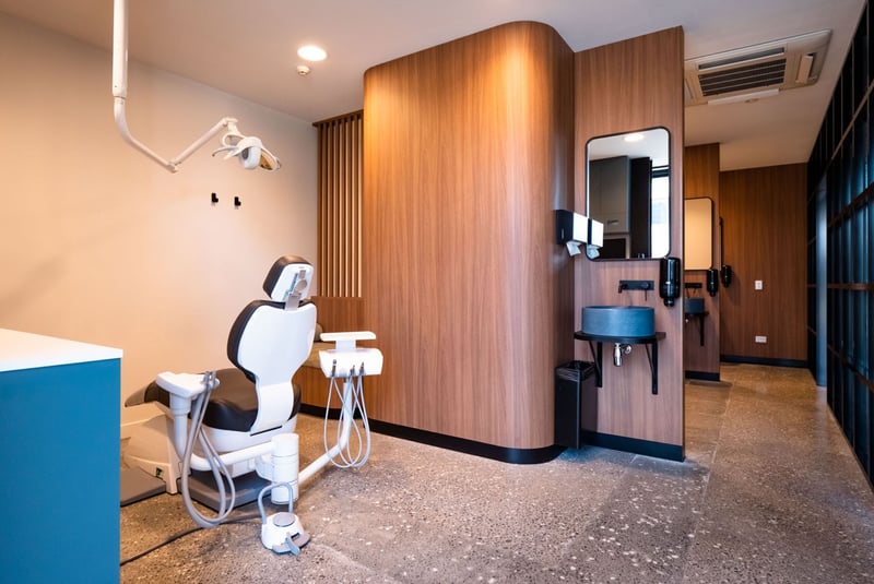
Orthodontic practices often implement an open floor plan featuring a consult bay with multiple chairs in one room. The use of partial dividers such as frosted or fluted glass panels between chairs gives patients the feeling of privacy without the need for an entirely separate room, nor the concern of blocking out natural light. This assembly-line layout, boasting multiple chairs with central workstations is an efficient design solution that suits the needs of both patient and practitioner.
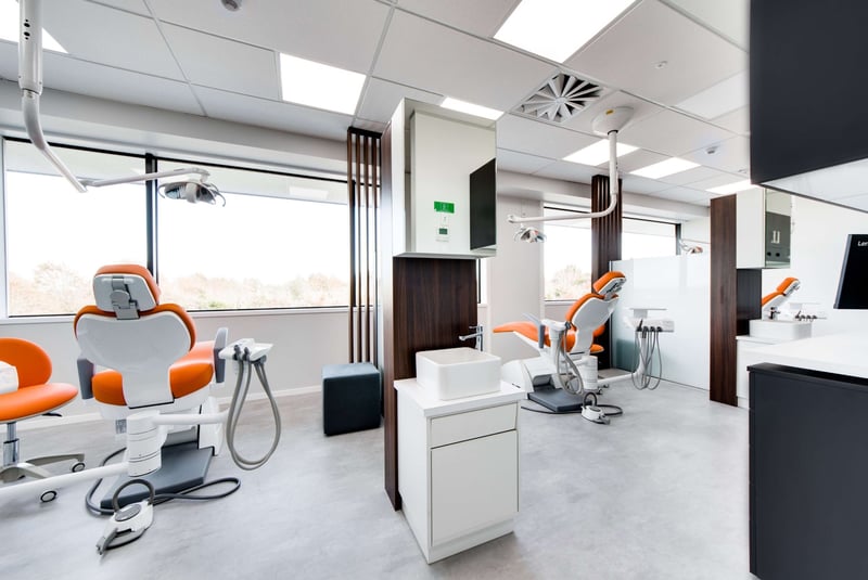
Be sure however to balance out open spaces with sufficient private consult rooms where patients and accompanying family can chat through procedures and treatment plans in a quieter, more private space.
Be creative and open-minded with the layout of your practice. Why not consider a floor plan that’s circular? Circularity encourages continuous movement. While this doesn’t necessarily mean consult chairs should be positioned in a semi-circle, it could simply mean one access way acts as an entrance to the operatory bay, while another acts as an exit seamlessly guiding patients out. Such circularity in a floor plan reduces any need to backtrack or risk bumping into others. The fewer intersections, and the less congestion, the better efficiency for all.
Ergonomics
A well-designed orthodontic practice should support optimal ergonomics for all who use the space.
Proximity of services
Key services such as sterilisation, laboratory, radiograph, and storage areas should all be in close proximity to patient chairs. Reducing distances between consult spaces and common services is one step closer to maximising productivity and supporting the health and wellbeing of staff. Creative solutions such as pass-through windows to the lab or sterilisation areas can be a great way to further reduce unnecessary movements.
Delivery Systems
Carefully consider the delivery systems you’ll use. There are benefits and drawbacks to all the options on the market and the ideal system will depend on your unique layout, the specific services you provide, and the personal preferences of you and your staff to support ergonomic efficiency on the job.
Delivery options such as rear or front delivery systems can be excellent for facilitating 4-hand procedures and offering ambidextrous flexibility. When examining patients for symmetry however, many orthodontists prefer to sit at the 12 o'clock position which is flexibility only a side delivery system can provide.
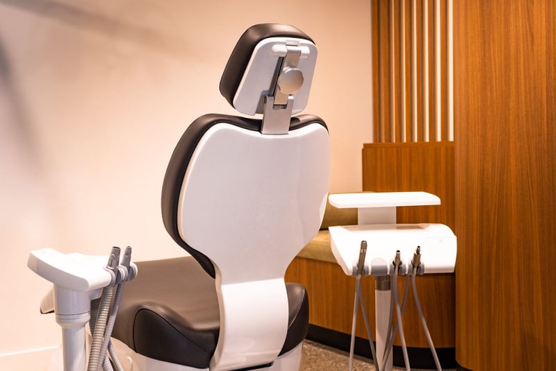
Carefully evaluate your situation, before making a decision. Ensure you’re reducing any fatiguing movements such as unnecessary reach and strain from your staff and always get advice from an expert before making decisions on the delivery systems you use.
Other Design Considerations
Improved wait time
Targeting a younger demographic requires design features that better appeal to this audience. Speed up the wait time and reduce any anxieties with distractions such as free Wi-Fi and a secluded play space for younger children to enjoy. Consider automating check-in and providing digital wait time estimates to simplify the visitation for these busy families.
A good design tactic is to try to balance out waiting room amenities to satisfy both children and adults. Provide toys that while entertaining for children are not noisy and disruptive to adults. It may be a fine line, but hitting the sweet spot that meets the needs of all those who enter your practice will enhance the experience for everyone.
Aesthetics and entertainment
Including interesting aesthetics in your practice allows you to add personality to the space and provide patients with something to focus on while they wait.
Interestingly, it’s no accident that features such as aquariums are commonplace in healthcare spaces. They’ve actually been proven to improve mood, lower both heart rate and blood pressure, as well as offer a fun distraction for all ages.
At Peak Orthodontics in Christchurch, they have adopted 'Edmund the Elephant', the mascot as their creative point of difference - a fun and memorable feature that offers a unique distraction for a younger audience.
The sky’s the limit when it comes to the aesthetics and personality you include in the final touches of your design. So get creative, be consistent with your brand and let your personality and points of difference shine through.
When you work with Dentec to design your space we take everything into consideration. This allows us to configure your space in a way that best satisfies your needs and optimises the patient experience. We work with you every step of the way from concept to completion, so know that your practice is in safe hands with us.
